Know what's working
Every time a fan takes part in a campaign, Game Set Engage records it. Those records add up to a clear picture: which campaigns pull fans in, how many points you've handed out, and where your supporters are watching from.
You have three places to read that picture:
- The campaign page — live numbers for one campaign, including a heatmap of where fans checked in
- Campaign Analytics — a roll-up across all your campaigns for a chosen time range
- Campaign Reports — a detailed, date-filtered breakdown you can read campaign by campaign
This guide walks through each one and explains what every metric means.
The campaign page: one campaign, live
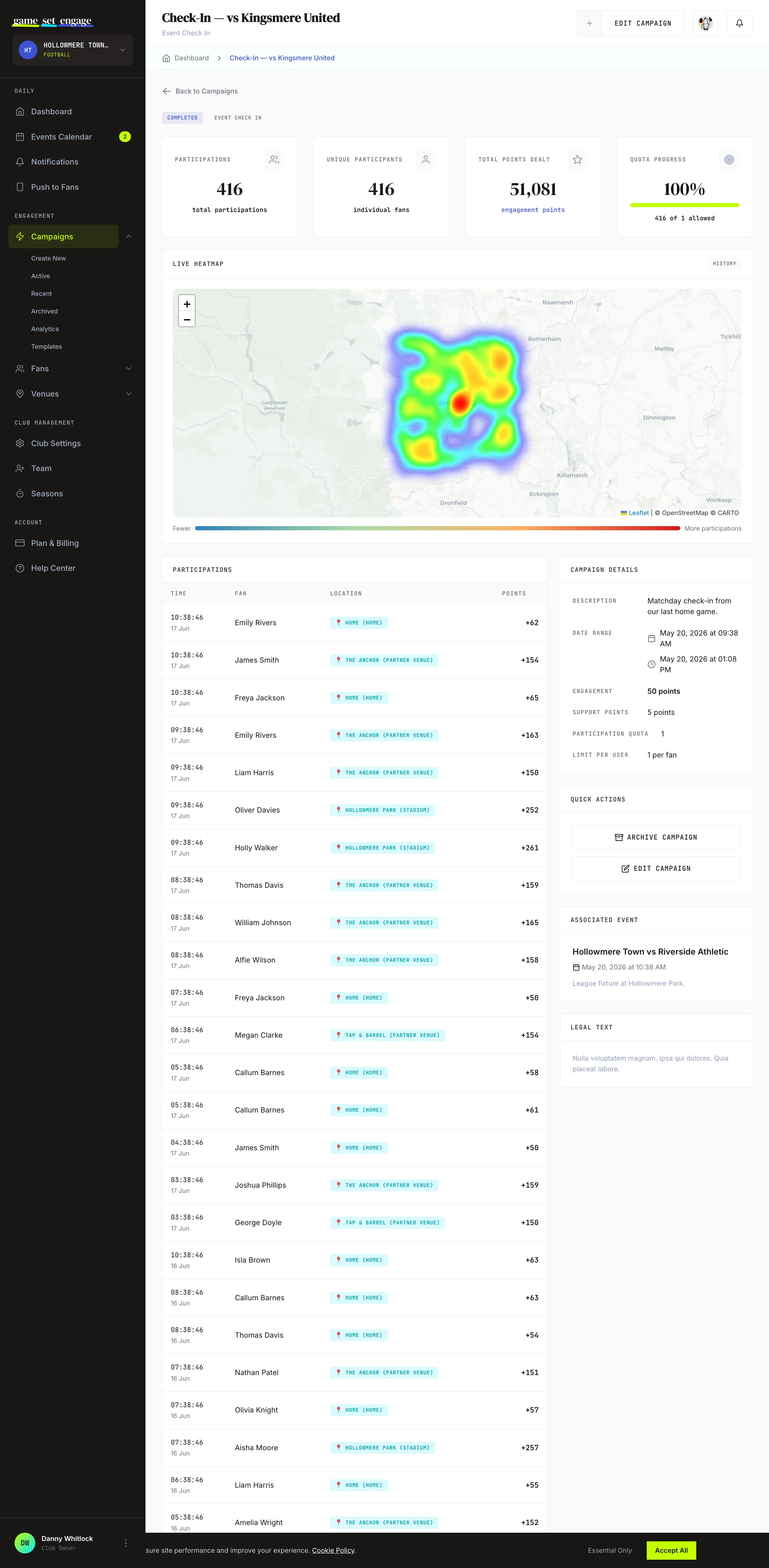
Open any campaign to see its own numbers. Four stat cards sit at the top:
| Metric | What it means |
|---|---|
| Total Participations | Every time a fan took part, counting repeats |
| Unique Participants | How many individual fans took part |
| Total Points Dealt | Engagement points handed out by this campaign |
| Quota Progress | How close you are to the campaign's participation cap, if you set one |
When a campaign is running, the page is live — new participations appear in the table as they happen, with a LIVE badge so you know the numbers are current.
Tip: Compare Total Participations against Unique Participants. If they're close, lots of different fans joined once. If Total is much higher, a smaller group is coming back again and again — both are good, but they tell you different things about your fanbase.
The check-in heatmap
For campaigns that record location — check-ins and QR scans — the campaign page shows a Heatmap. Brighter, denser areas are where more fans took part. It centres on your event or club location and fills in as participations come in.
This is the fastest way to see whether fans are turning up at the stadium, gathering at a partner venue, or watching from home.
Campaign Analytics: the roll-up
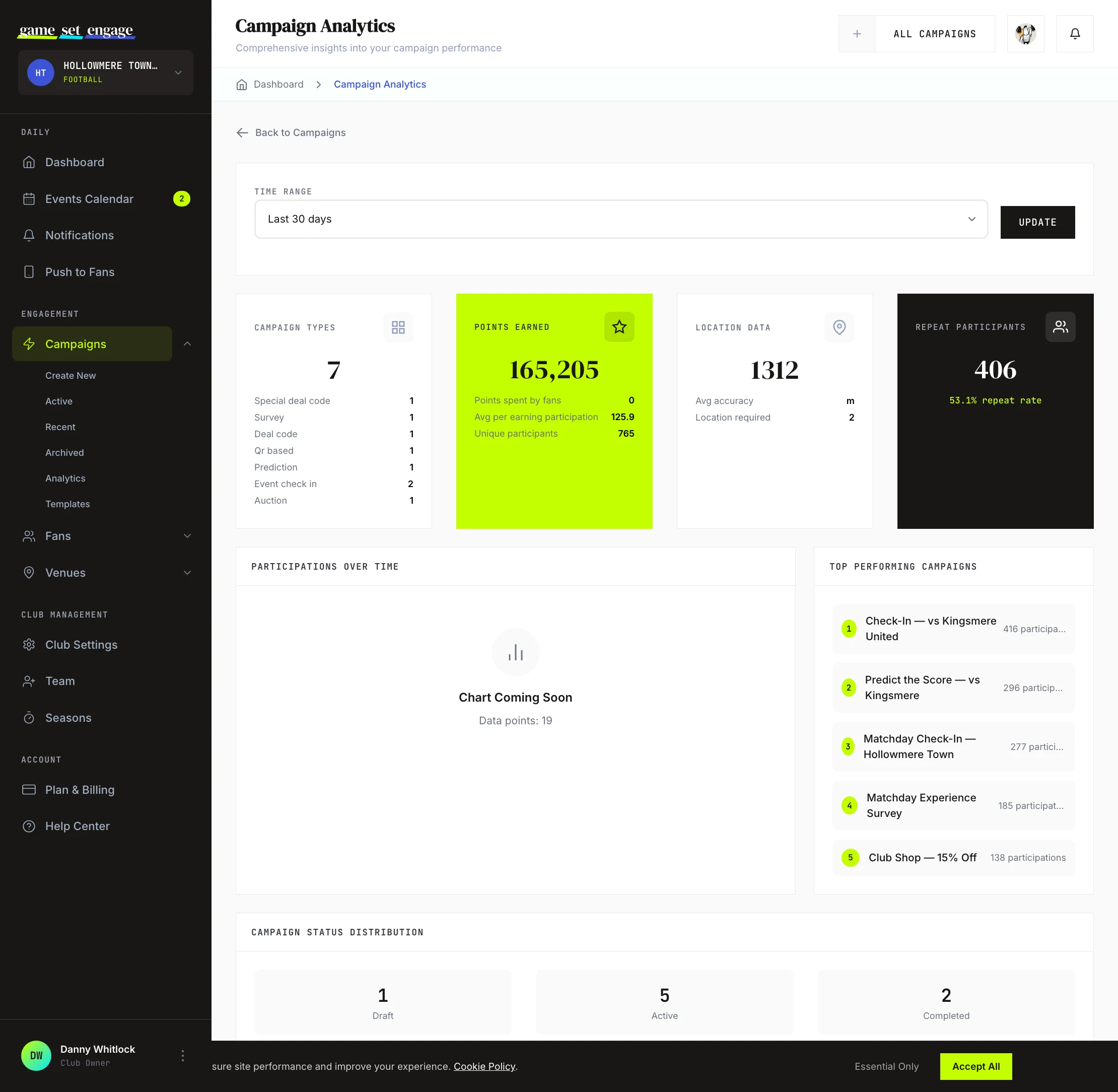
The Analytics screen pulls every campaign together for a time range you pick — last 7 days, 30 days, 90 days, or the last year. Change the range with the filter at the top and the whole page updates.
The cards
Campaign Types shows how many of each type you've run in the range, so you can see your mix at a glance.
Points Earned is your points ledger. It separates points handed out to fans from points fans spent (on auctions, for example), so the headline number isn't muddied by points coming back in. You also see the average points per earning participation and the count of unique participants.
Location Data appears when your campaigns recorded check-in locations. It shows how many participations carried a location, the average location accuracy in metres, and how many of your campaigns required location to take part.
Repeat Participants counts the fans who took part more than once in the range, with a repeat rate underneath. A rising repeat rate means fans are coming back — the strongest signal that your campaigns are landing.
Top performers and status
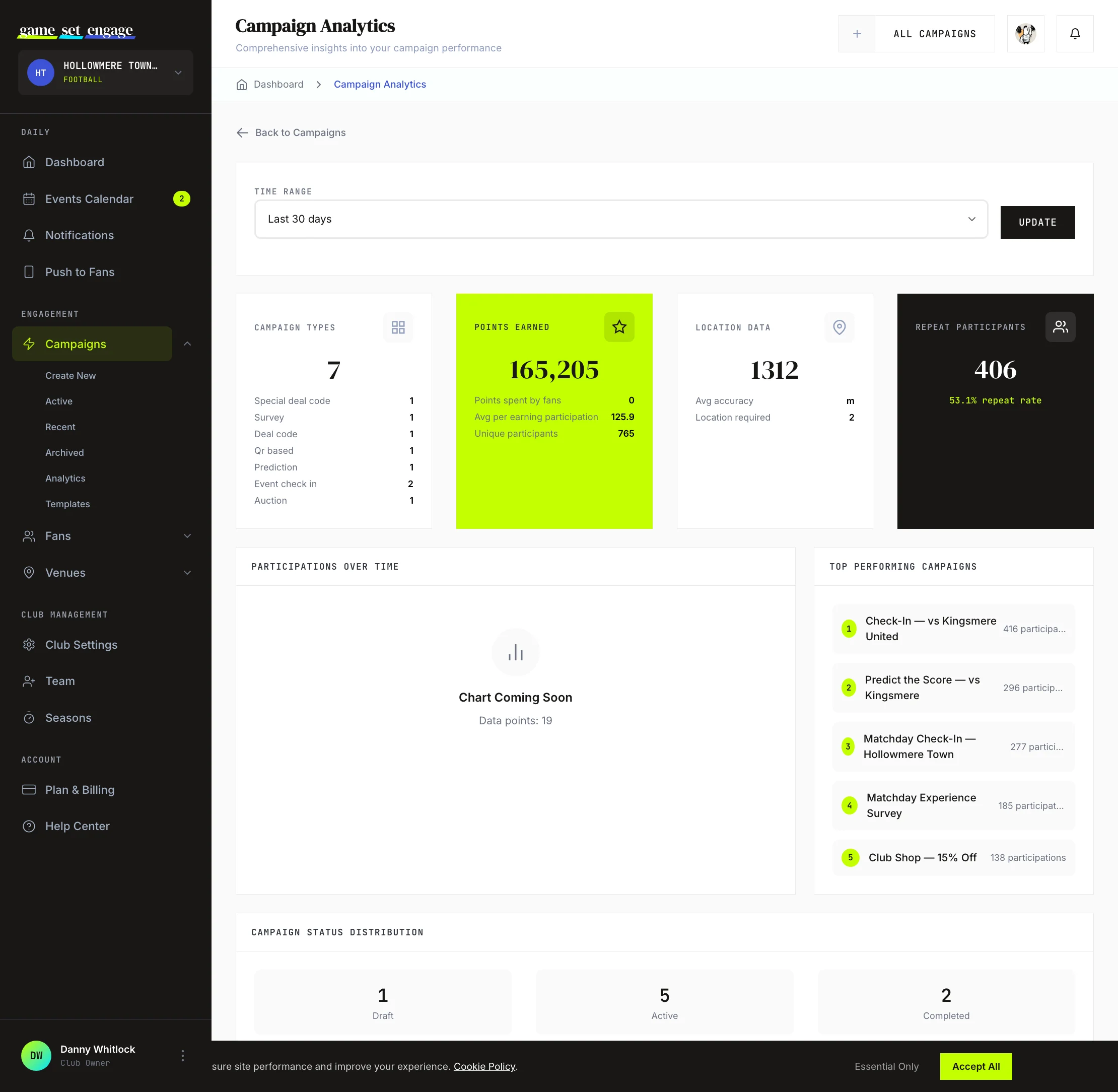
Lower down, Top Performing Campaigns ranks your campaigns by participation for the range, so you can see what fans respond to. Campaign Status Distribution counts how many campaigns are draft, active, completed, or archived — a quick read on how much you have in flight.
Tip: Check Top Performing Campaigns before you plan your next one. If check-ins outpace surveys, lead with a check-in. Do more of what your fans already vote for with their participation.
Campaign Reports: the detailed view
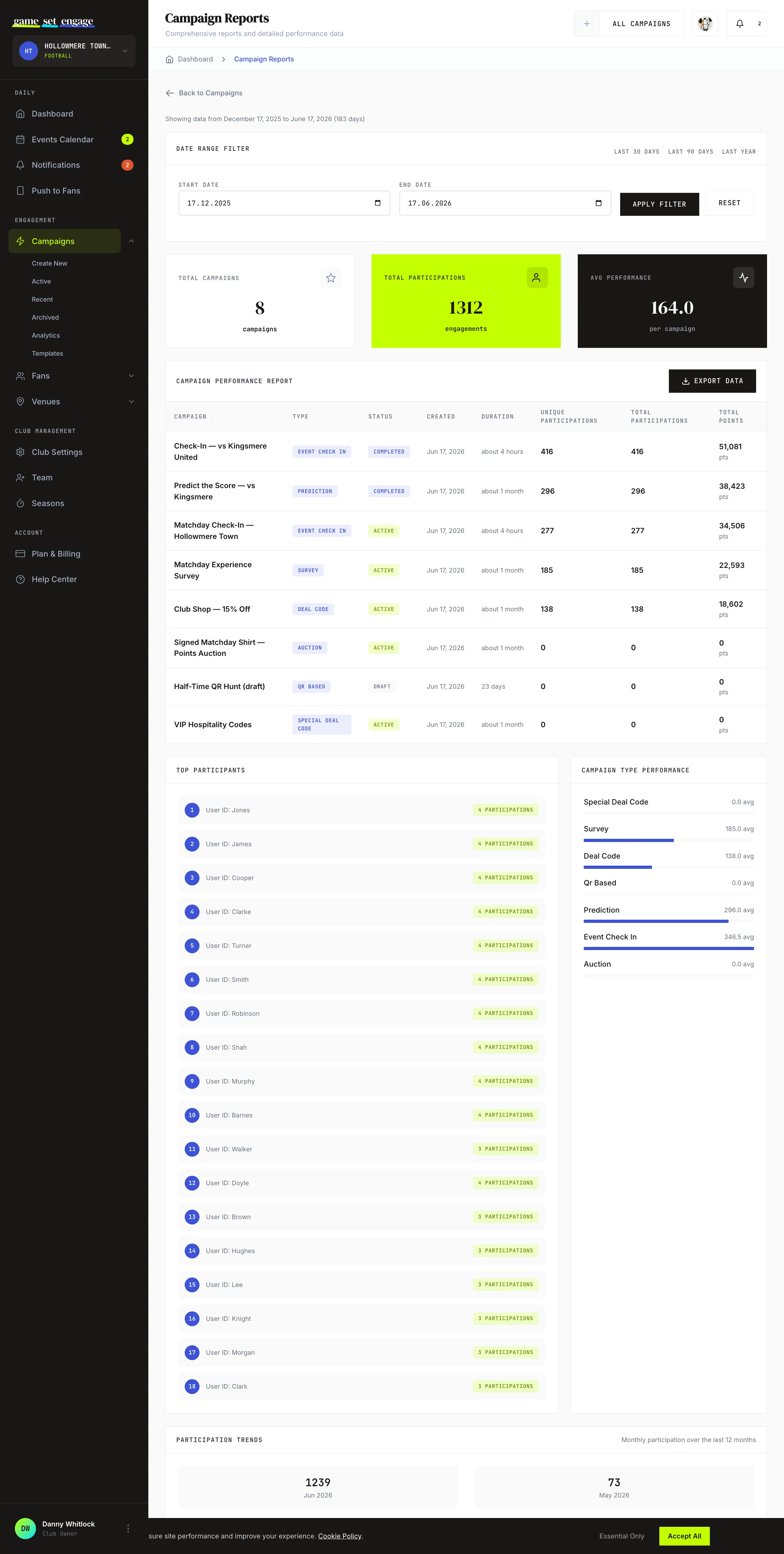
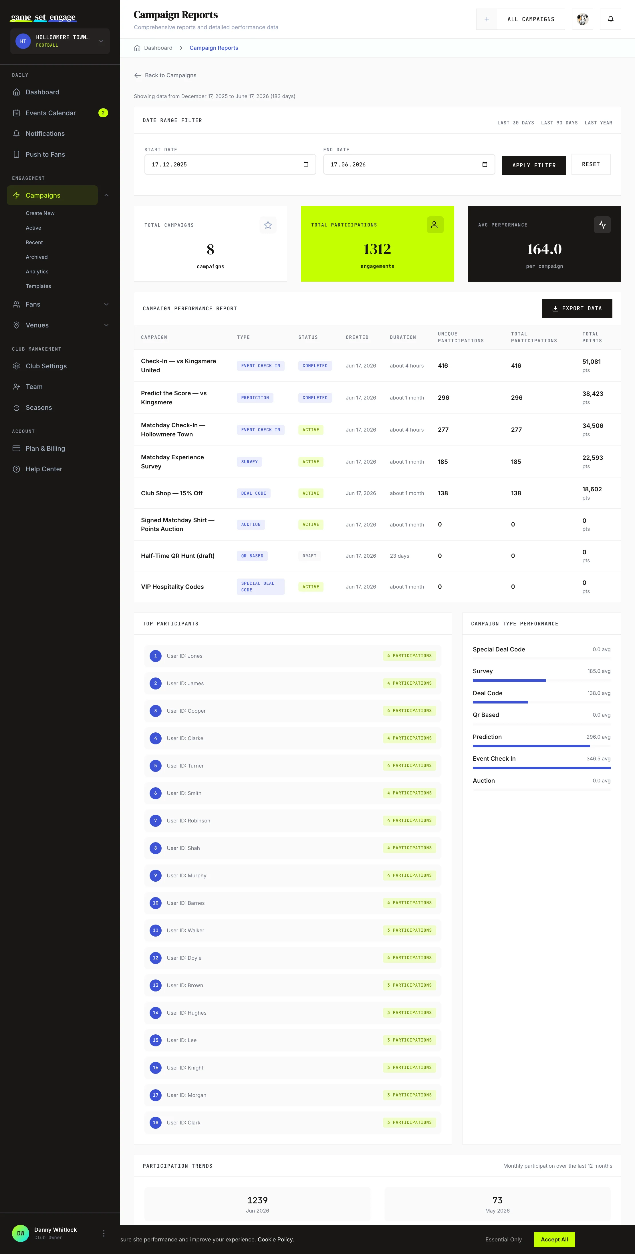
The Reports screen is for a closer look. Set a start and end date — or use the Last 30 days, Last 90 days, or Last year shortcuts — and the page rebuilds for that window.
Summary cards
Three cards sum up the range: Total Campaigns, Total Participations, and Avg Performance (participations per campaign). They give you the shape of the period in one line.
The campaign performance table
The main table lists every campaign in the range with these columns:
| Column | What it means |
|---|---|
| Campaign | The campaign name |
| Type | Check-in, deal code, survey, prediction, and so on |
| Status | Draft, active, finished, completed, or archived |
| Created | When you made the campaign |
| Duration | How long it ran |
| Unique Participations | Individual fans who took part |
| Total Participations | Every participation, counting repeats |
| Total Points | Engagement points this campaign handed out |
A campaign shows Finished when it was active but its end date has passed — handy for spotting campaigns that have run their course.
Top participants and type performance
Below the table, Top Participants ranks your most engaged fans by how many times they took part. Campaign Type Performance shows the average participation for each campaign type as a bar, so you can see which formats work hardest. Participation Trends plots participations month by month, so you can see momentum building or fading.
Points: what "dealt" really means
Across these screens you'll see points framed two ways, and the distinction matters:
- Points dealt / distributed — points handed out to fans for taking part
- Points spent — points fans handed back, for example bidding in an auction
Game Set Engage keeps these separate so a busy auction doesn't make it look like you stopped rewarding fans. When you read your points ledger, you're seeing the true flow in both directions.
A reminder on how points are set: Game Set Engage does not multiply points automatically. You choose the point value for each campaign. For check-ins, the recommended pattern is to reward presence — most at the stadium, less at a partner venue, least at home — but those values are yours to set.
Exporting your data
You can take the numbers off-screen when you need them:
- Survey and prediction responses export as a CSV from the Responses panel on a survey or prediction campaign — one row per fan, with their answers, result, and points. See Surveys and predictions for the full breakdown.
The Reports screen is built for reading on screen and filtering by date; for a row-level export of individual fan answers, use the CSV export on the survey or prediction campaign itself.
A word on offers and venues
Fan offers — the discount a partner venue gives for checking in there — are set and tracked on the venue side, not on the campaign analytics screens. To see how venue offers and earnings are performing, head to your venue guides.
What's next
- Understanding your fans — turn participation into a picture of who's engaging
- Surveys and predictions — build, resolve, and export response data
- Building your venue partner network — add the partner venues that show up in your check-in locations
- Venue earnings and offer settings — where venue offers and their performance live